
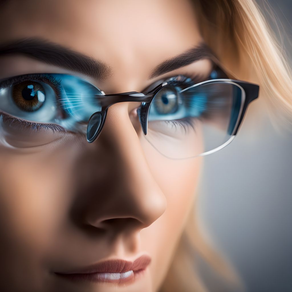
Phone Theme Preferences and Eye Health
When it comes to digital devices, picking between dark and light themes isn’t just a matter of taste; it’s also about eye health and comfort. As I’ve studied user interface design, I’ve learned that these choices can have a significant impact on how we see things every day.
From direct feedback and user studies, it’s clear that some users choose dark mode because they think it’s easier on the eyes when there isn’t much light. People often make this choice because they think it will reduce glare, which can help their eyes feel better when they use digital devices for long periods of time. Because of this feedback, we looked more closely at how different backgrounds affect eye health.
A lot of people like light themes in business or highly lit settings because they reflect a lot of light, making things easier to see and maybe even easier to focus and read. The problem, though, is that users often say that too much blue light makes their eyes tired after long periods of computer time.
To get real information, I asked people who filled out user polls about their experiences with different themes in different lighting situations. A lot of people said they liked being able to switch between modes based on the time of day or where they were. This adaptable method appears to benefit both user comfort and eye health because it works with our natural circadian rhythms.

Understanding How Dark Modes Work Technologically
Certain technical concepts underpin dark mode, altering the display of information. The background of the user interface changes from light (often white) to dark (often black or gray) when you put your phone or computer into dark mode.
OLED (Organic Light Emitting Diode) technology turns off the black pixels in screens, resulting in a reduction in light output. On LCD (Liquid Crystal Display) screens, on the other hand, the backlight stays on across the panel, just blocking light to make darker tones. Because of this, OLED screens can show darker blacks while using less power to do so. Devices with these screens often associate longer battery life with dark mode.
As someone who has worked on developing apps, I saw personally how changing an app’s look to dark mode could make the battery last much longer. Examining user usage data revealed that not only did batteries perform better, but users also modified their late-night device usage habits. They stayed on apps for longer amounts of time without changing the brightness.
A bright white screen makes the color contrast very strong. Dark mode makes it less sharp. I ensured optimal contrast ratios in my apps to prevent reading impairments, particularly in dimly lit environments. This balance is very important because not enough contrast can make your eyes hurt.
Another interesting thing I learned was the link between color frequencies. Blue light, which is common in bright modes, has a shorter range and more energy, which can make your eyes tired after a while. To lessen this effect, I used darker themes and warmer colors to cut down on blue light exposure. This would make the watching experience more relaxed for the user.
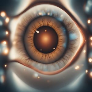
Analyzing the Eye Health Benefits of Dark Mode
Not only is switching to dark mode a matter of taste, but it may also be good for your eyes, especially when there isn’t much light around. As I researched user interface design, I talked to a number of ophthalmologists. One thing that kept coming up was how darker themes might help with eye strain.
One important reason is that dark mode cuts down on glare, which means the pupil doesn’t have to shrink as often. When it’s bright outside, the pupil narrows to let less light in. When it’s dark inside, it opens up. Less of the cycle of constriction and expansion happens when you use dark mode in dim light. This can help keep your eyes from getting tired.
While redesigning a digital reading platform, I monitored user feedback and discovered that numerous users reported improved eye comfort when using the dark mode. This was likely due to less glare, which can make it harder for tears to evaporate. People who read on their screens for long periods of time were especially aware of this finding.
One more thing is that it might help you sleep better. Spending too much time in front of bright screens, particularly right before bed, can halt the production of melatonin, a hormone that regulates sleep rhythms. Users said they slept better when they used dark mode to reduce exposure. This was a big part of my design because it’s important for your health to keep your natural circadian rhythms.
It’s interesting that dark mode isn’t always the best, even though it can provide these advantages. The context of its use is crucial. For instance, well-lit areas or papers requiring detailed reading may benefit more from a light mode. This comprehensive understanding enabled me to create designs that prioritize the user and adapt to various situations and tasks.
In every project I’ve worked on, I’ve thought about these things, trying to give users an experience that not only looks good and works well, but also is good for their eyes.
Read also – EYE RELAXATION EXERCISES.

Possible Negative Effects of Dark Mode on Vision
There are some problems with dark mode that users should be aware of in order to make better decisions about their display settings. As I worked on various user interface projects, I had to deal with a number of issues that dark mode brought up, particularly when it came to reading and how things looked in different lighting situations.
One of the main worries is how clear the text is. Most of the time, it’s easier to read dark text on a light background than light text on a dark background. This is due to the way light and dark colors affect our eyes. Bright backgrounds reflect more light, which helps the eye’s pupils close a little more, making focus sharper. A dark screen, on the other hand, makes the eye open wider, which can make letters less clear.
On the darker backgrounds, I tried out different text types and sizes to get around these problems. The goal was to make it easier to read without taking away from the good looks and useful features of dark mode. According to what users said during testing sessions, increasing line height and letter spacing could make text easier to read. The design standards for applications underwent changes as a result.
Another issue is the potential for distortion. For people with astigmatism, seeing light text on a dark background can blur the text. This is called halation. It can be hard on the eyes because they have to work hard to focus on the fuzzy edges. To lessen this effect, I changed the brightness and contrast of the text against the dark background based on feedback from a focus group of users with different levels of astigmatism.

A Look at the Differences Between Dark Mode and Light Mode
In my projects, determining the superiority of dark mode over light mode often involves comparing their real-world usage. To do this effectively, I set up controlled user testing settings where people could use both modes in the same way and give me feedback on how they felt.
One important thing that these tests showed was that the choice between dark and light modes often relied on the lighting around the person. When it was dark outside, people liked dark mode because it cut down on the device’s light output, making it easier on the eyes and reducing eye pain. Light mode, on the other hand, was more comfortable for subjects in bright places or during the day, as they felt less strain when reading or working for long amounts of time.
We also thought about the effect on cognitive load, or how easy it is to handle knowledge in each mode. Some studies show that light mode might help you understand and concentrate better on detailed work tasks, like reading long texts or doing things that require a lot of focus. According to what I found in my user tests, people did better on tasks that required them to understand what they were reading when they were in light mode.
From a design perspective, adding user-controlled settings that let the device automatically switch between modes based on light sensors or time settings worked well. By adding adaptive styles to the apps I made, users could get the most out of each mode based on their tastes and the conditions they were in.


Comparative Analysis: Dark Mode vs. Light Mode
After gaining basic knowledge about phone themes and their impact on eye health, a thorough comparison of dark and light modes for various user scenarios was necessary. We gathered both emotional and objective data from users on how each mode affects eye health for this study.
One of the most important things that these comparison studies showed was how each mode affected the user’s ability to deal with screen glare and eye strain. People constantly said that dark mode, which lowers the brightness, was good for use at night. Users reported feeling less tired and dry in their eyes, a logical response given the reduced exposure to bright light. This could help lower melatonin reduction and improve the quality of sleep.
On the other hand, light mode worked better in places with lots of light or for jobs that needed a lot of focus and attention to detail, like reading thick text or doing analytical work. The realistic lighting seems to improve text contrast and general visibility, which leads to better performance on cognitive tasks. For example, reading speeds were higher, and users remembered more of what they read during tests.
Also, when I looked into the color temperature settings, I found that making changes to these could make the benefits of each style even better. For example, lowering the amount of blue light in dark mode and changing the color palette in light mode to warmer tones could help ease eye strain and make watching more enjoyable.
By incorporating these results into user-centered design, I was able to improve the digital products I worked on so they better met the wants and preferences of a wide range of users while still putting eye health first. Not only did this method make users happier, but it also helped us learn more about how to make digital environments healthier for our eyes.
Read also – Eye Drop Recall.